Registation
2025
Main activities
Mobile App UI/UX
UI Design
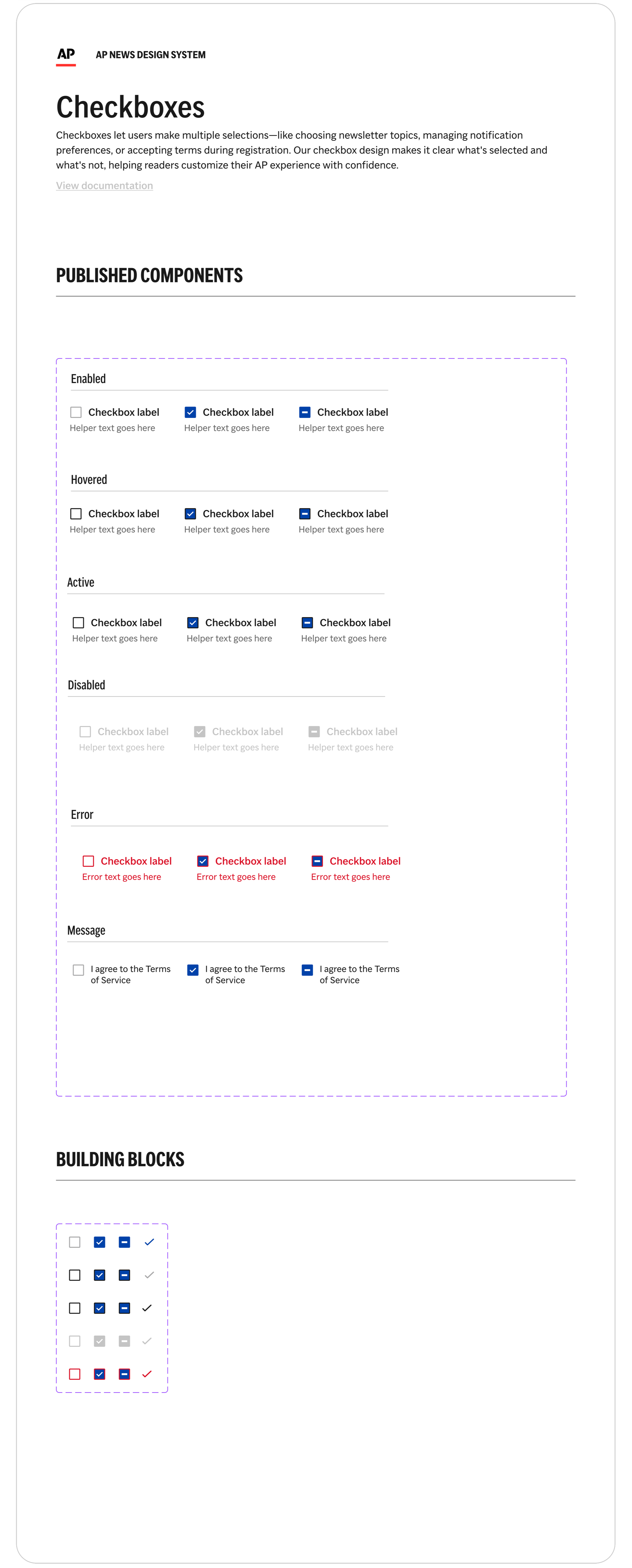
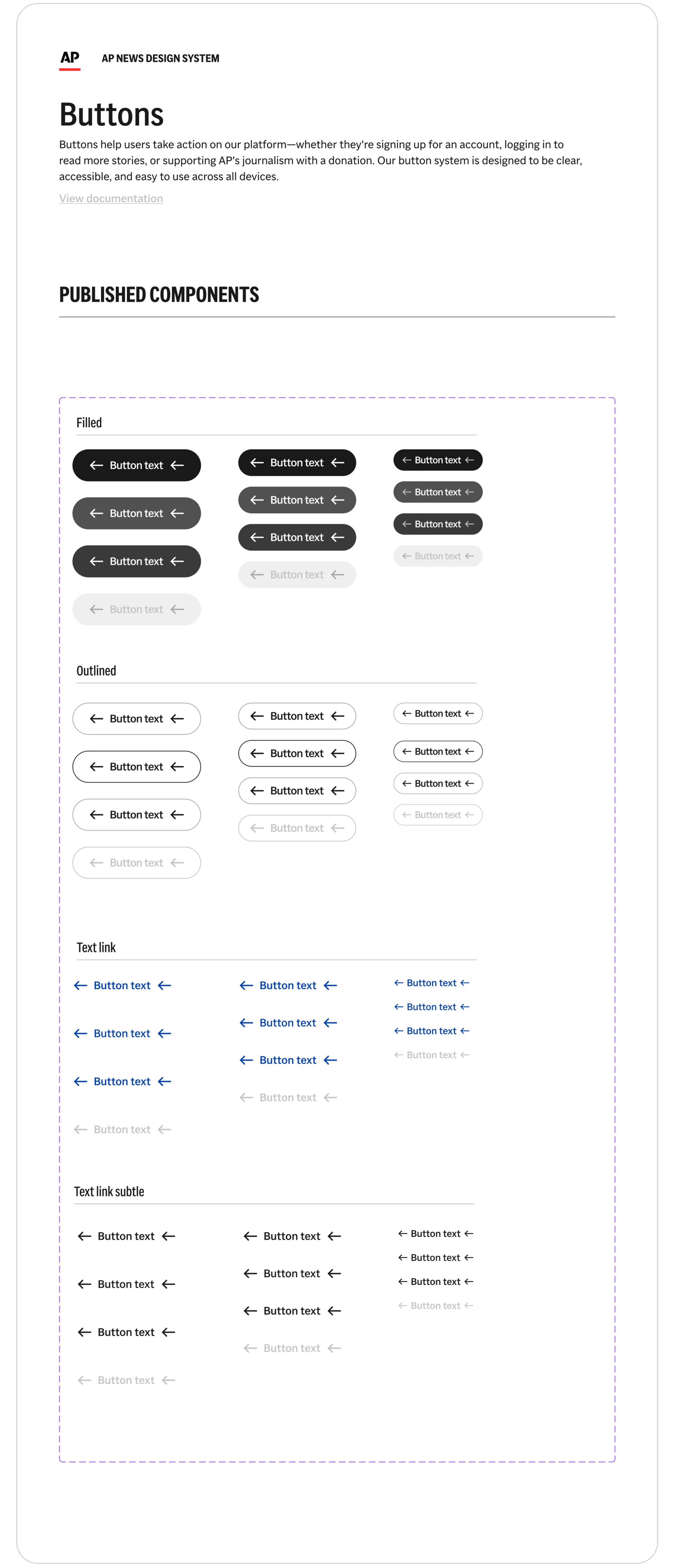
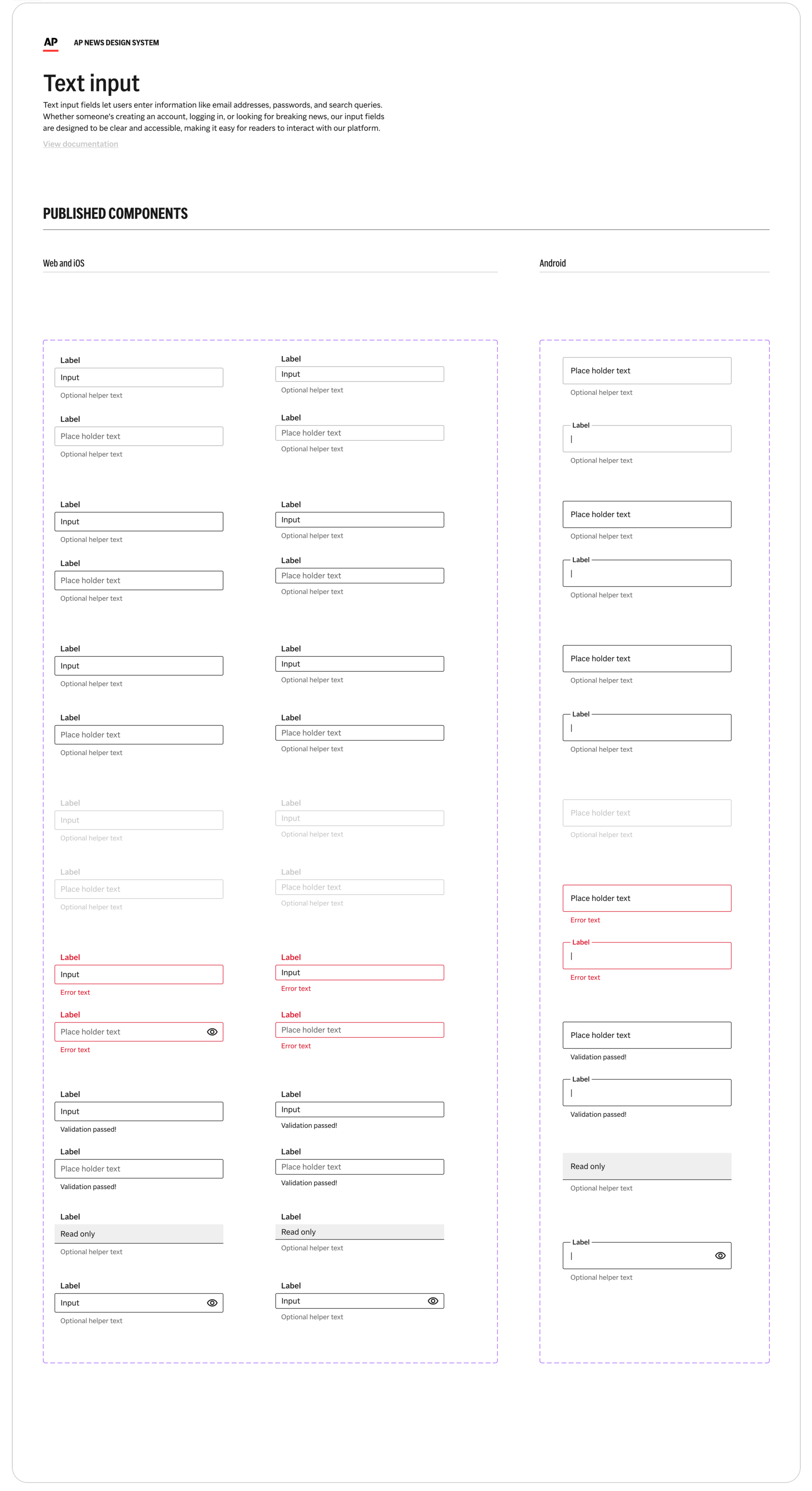
Components, buttons, colors
UX Design
User research, etc...
Ticket Creation
Documentation, iOS & Android
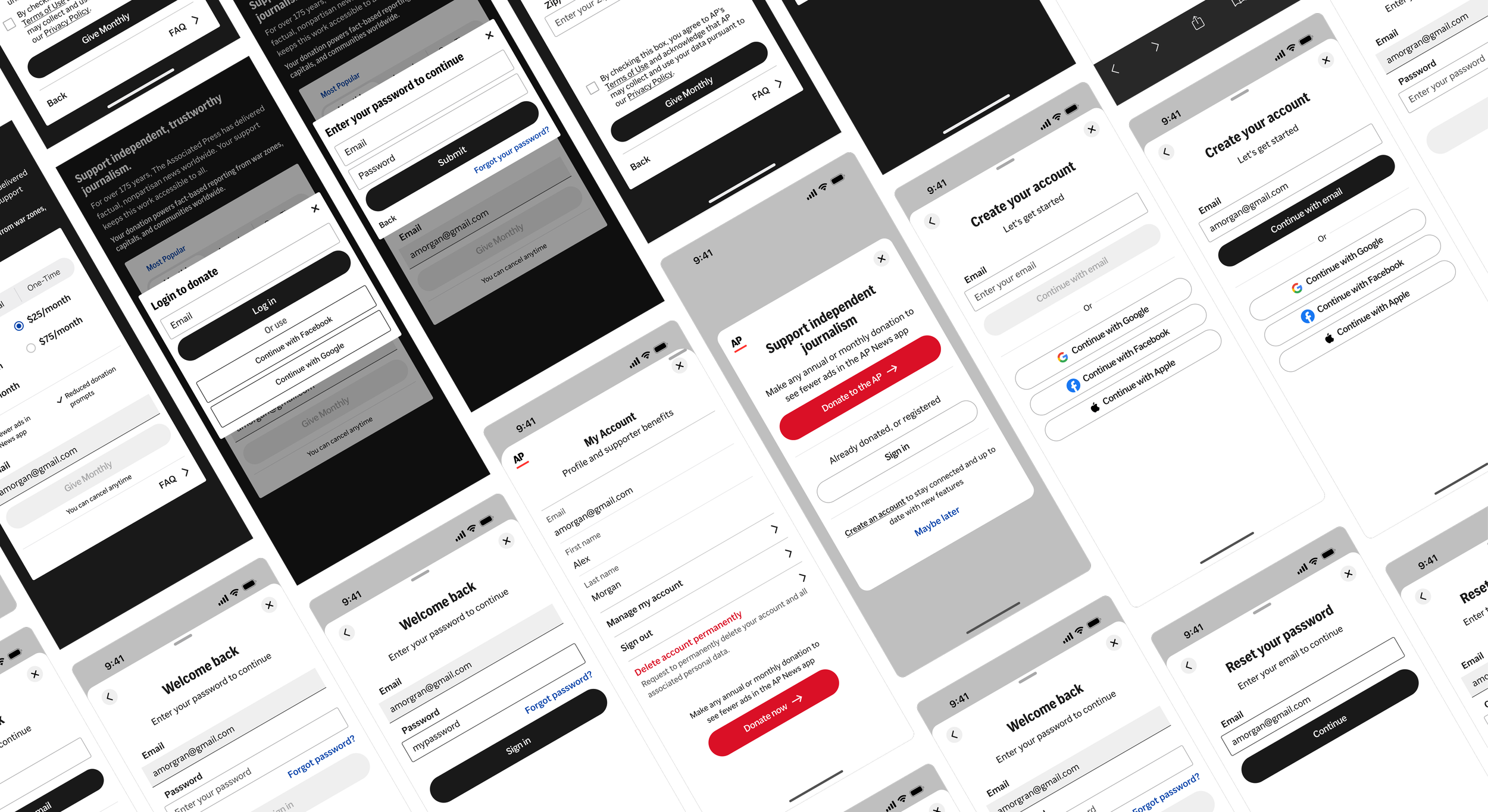
As part of a broader fundraising initiative, I worked on designing a native account creation and registration experience for the AP News app across iOS and Android. The goal was to support donations, unlock donor entitlements such as an ad-light experience, and establish long-term user relationships directly within the app. This work focused on translating existing web-based account logic into a mobile-first experience, designing scalable UI and UX components, and integrating all patterns into the AP design system to ensure consistency, reuse, and future growth across platforms.
Where the experience broke
Web-only account creation
Account creation existed exclusively on the web, forcing app users to leave the app to register, verify their account, or recover access.
Users frequently started account creation on the web but failed to return to the app to complete verification, resulting in incomplete accounts and lost entitlements.
Broken handoff back to the app
The system supported multiple verification methods email links and code-based flows which the app needed to support without increasing cognitive load or user confusion.
Complex verification requirements
Strategy & Approach
We weren’t simply recreating the web registration flow in the app. The app needed to support account creation, validation, recovery, and entitlement access natively—while integrating with an existing backend, donation system, and multiple verification methods.
Native-first experience
Account creation should feel native to the app, not like a web flow transplanted into mobile.
Verification without confusion
The UI needed to support both code-based and email-link verification without branching users into dead ends.
Reusable system components
Every step of the flow needed to scale across sign-up, sign-in, donation-triggered entry points, and account recovery.
Clear progress and completion
Users should always understand where they are in the process and what’s required to finish.
System-first patterns
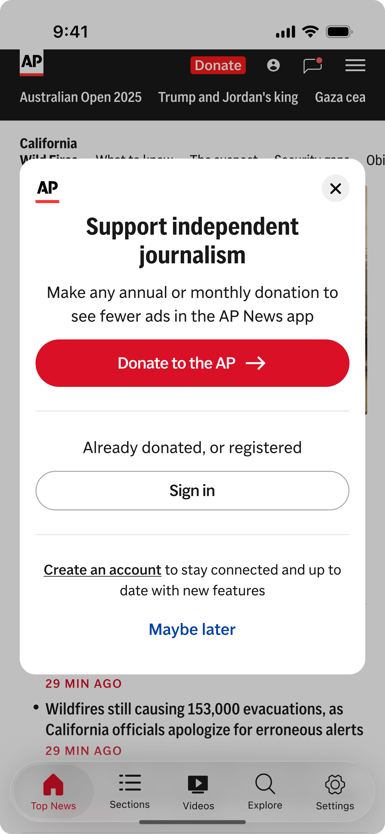
We paired bottom sheets with reusable modules to create a flexible, system-driven registration experience. Bottom sheets handled contextual actions like sign-in and verification, while modules surfaced account states and next steps across the app allowing the flow to scale across multiple scenarios without fragmenting the UI.
User scenarios
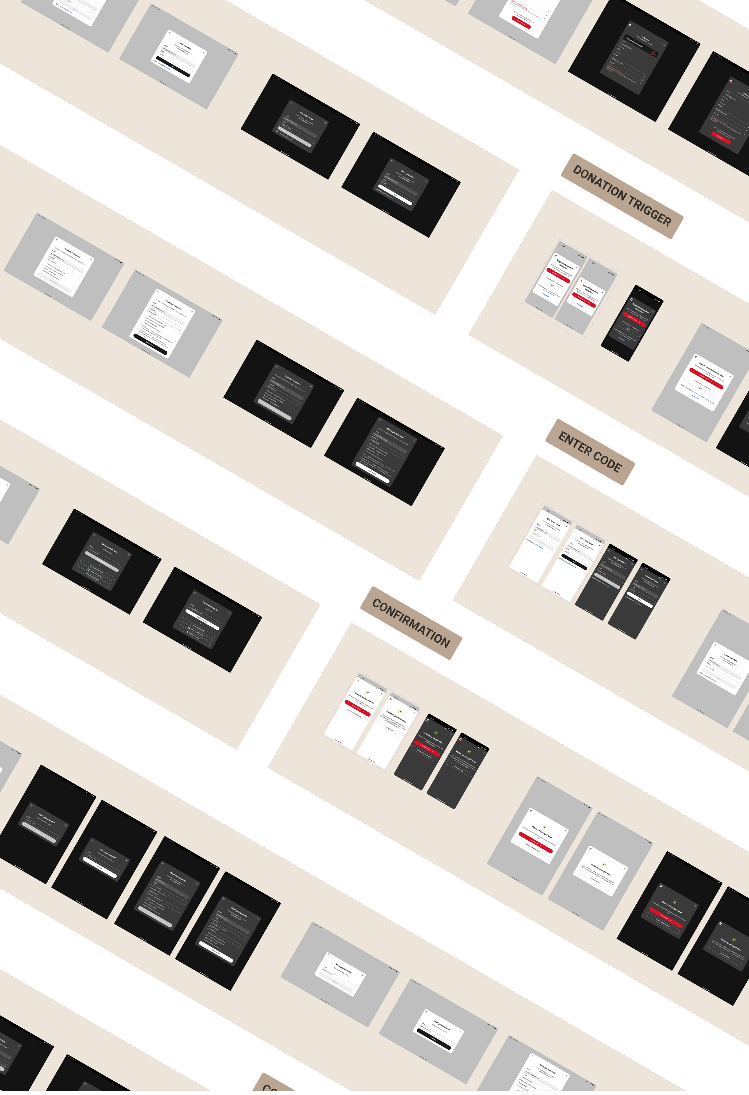
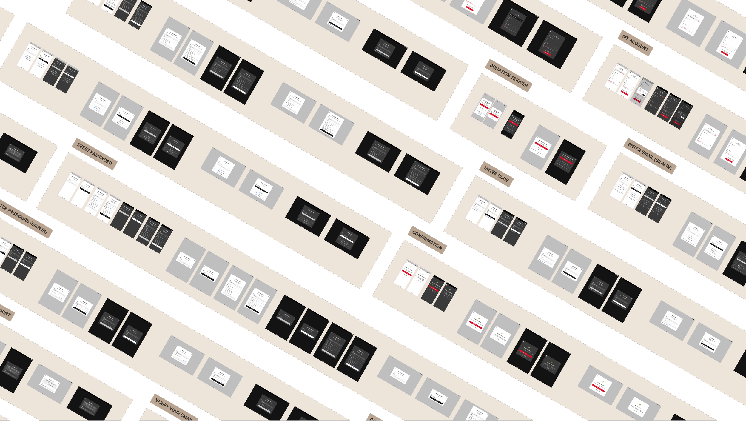
Because account creation previously existed only on the web, users entered the app in a wide range of states. Before designing UI, we mapped the primary scenarios the app needed to support to ensure no user reached a dead end.
Local components → System patterns
This project introduced several app-specific components that were later standardized and absorbed into the design system, reducing duplication and establishing a shared foundation for future account-related flows.
A representative account creation flow
To demonstrate how the system worked in practice, this flow shows how an anonymous app user creates and completes an account using modular components and bottom sheets without breaking reading context.
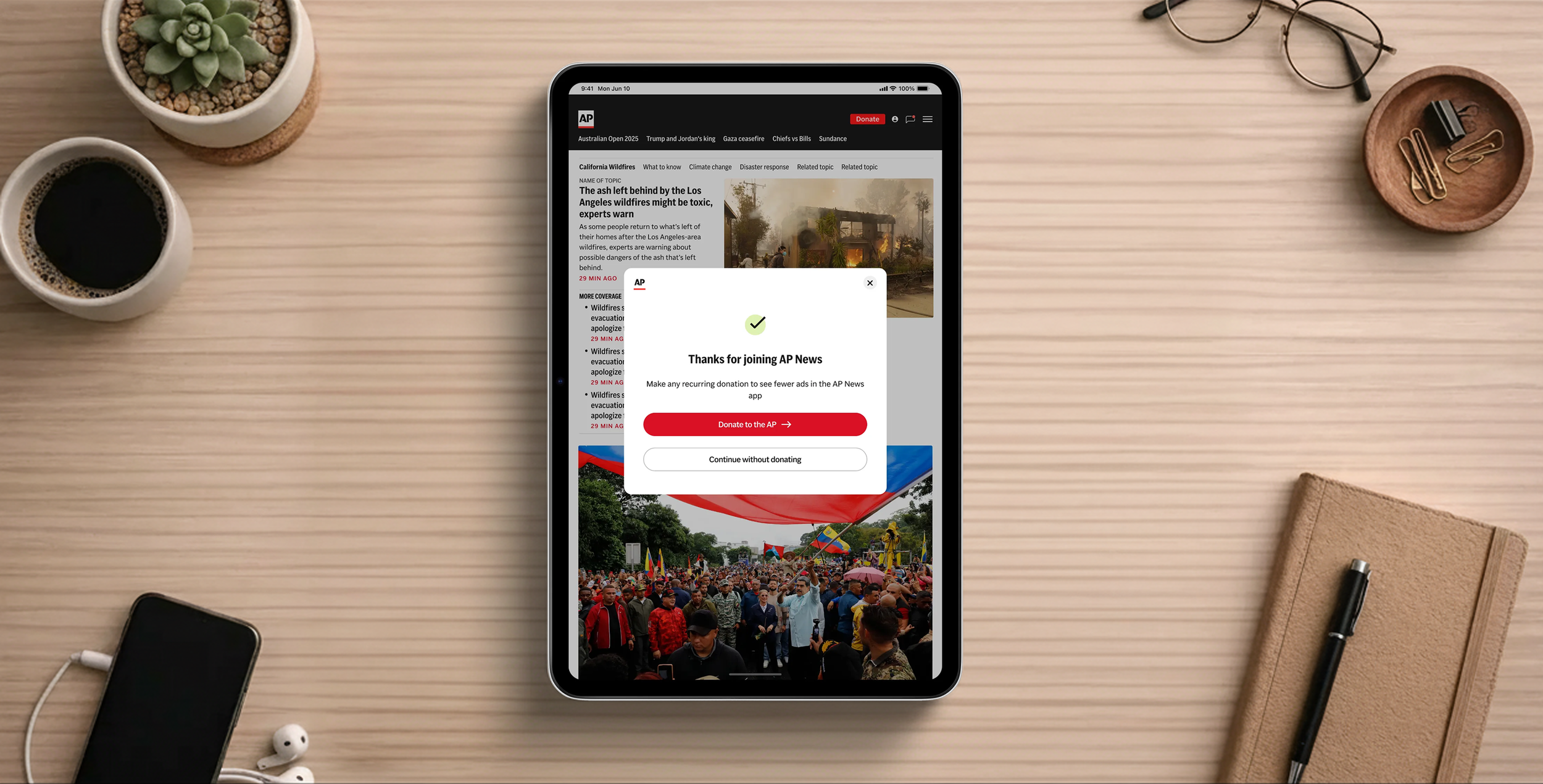
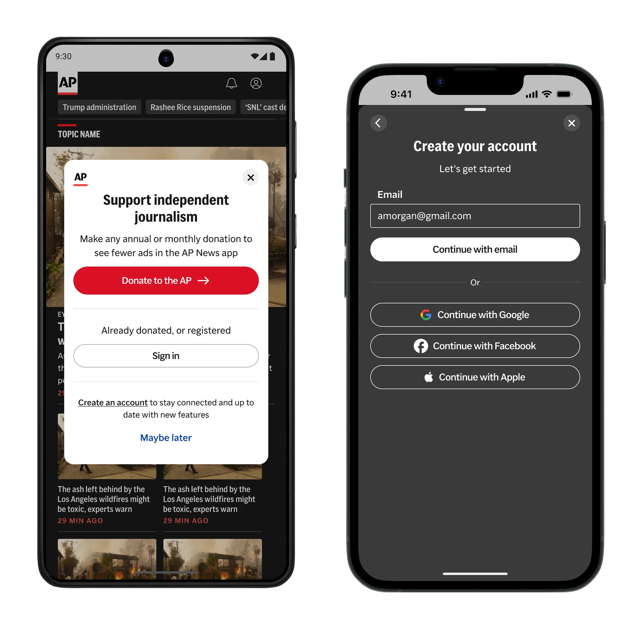
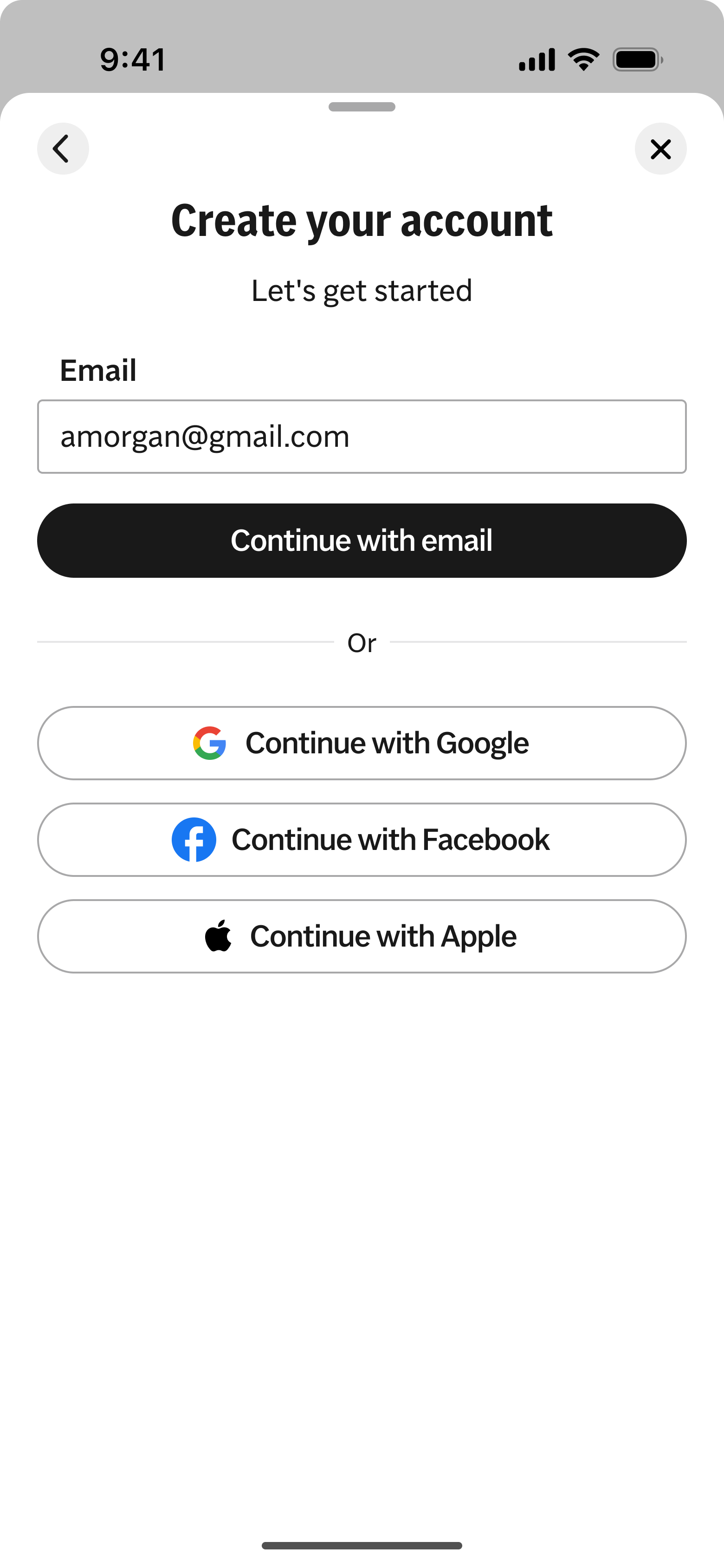
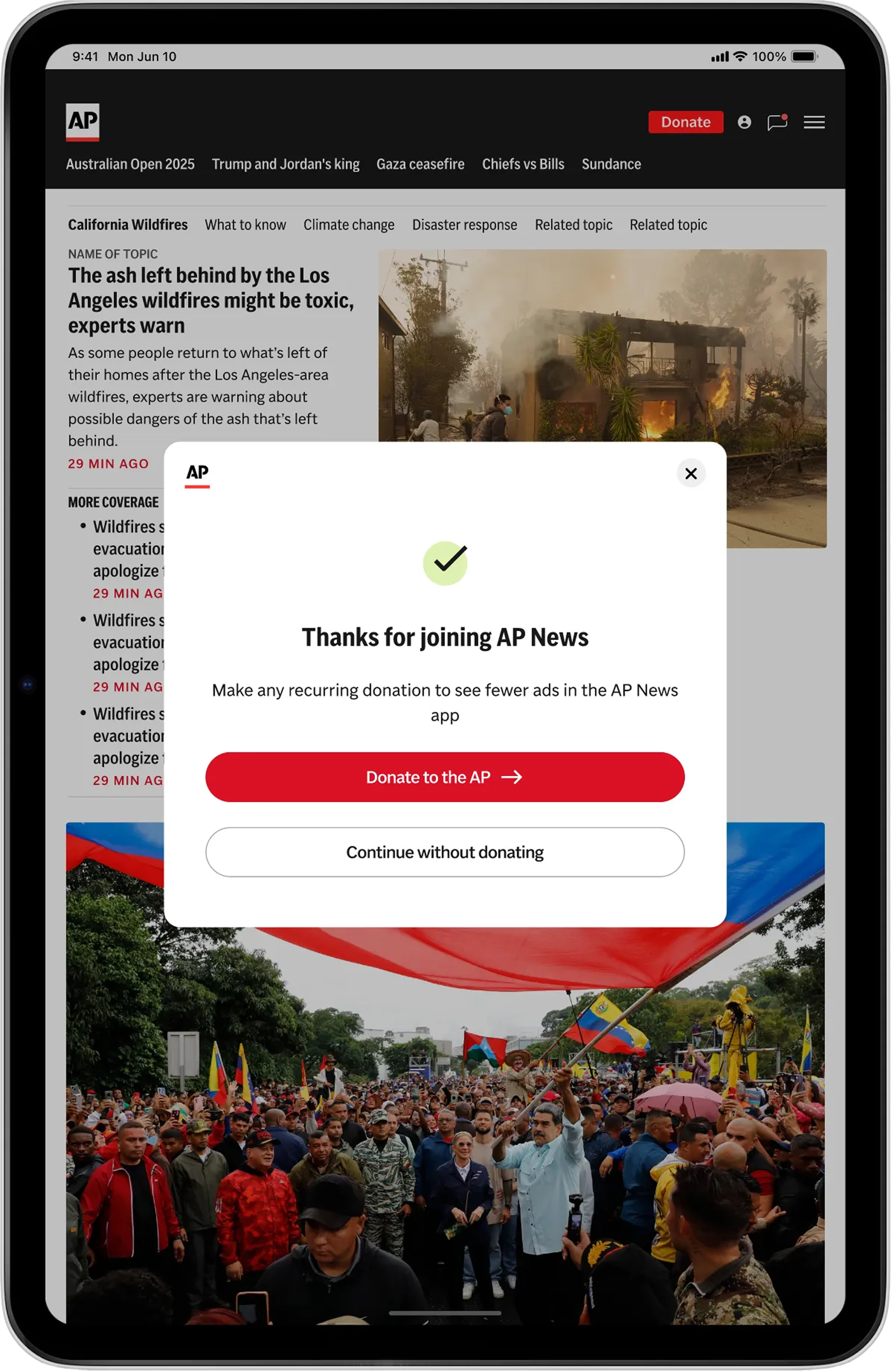
Account creation is introduced at moments of high intent using a bottom sheet, allowing users to continue reading without losing context.
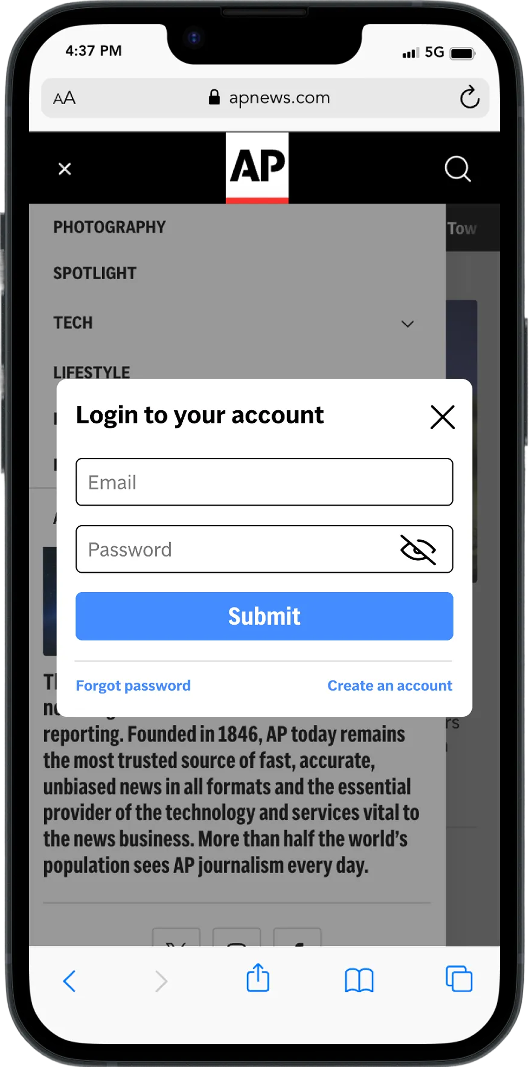
Email-first entry lets the system determine whether a user should sign in or create an account removing an early decision points
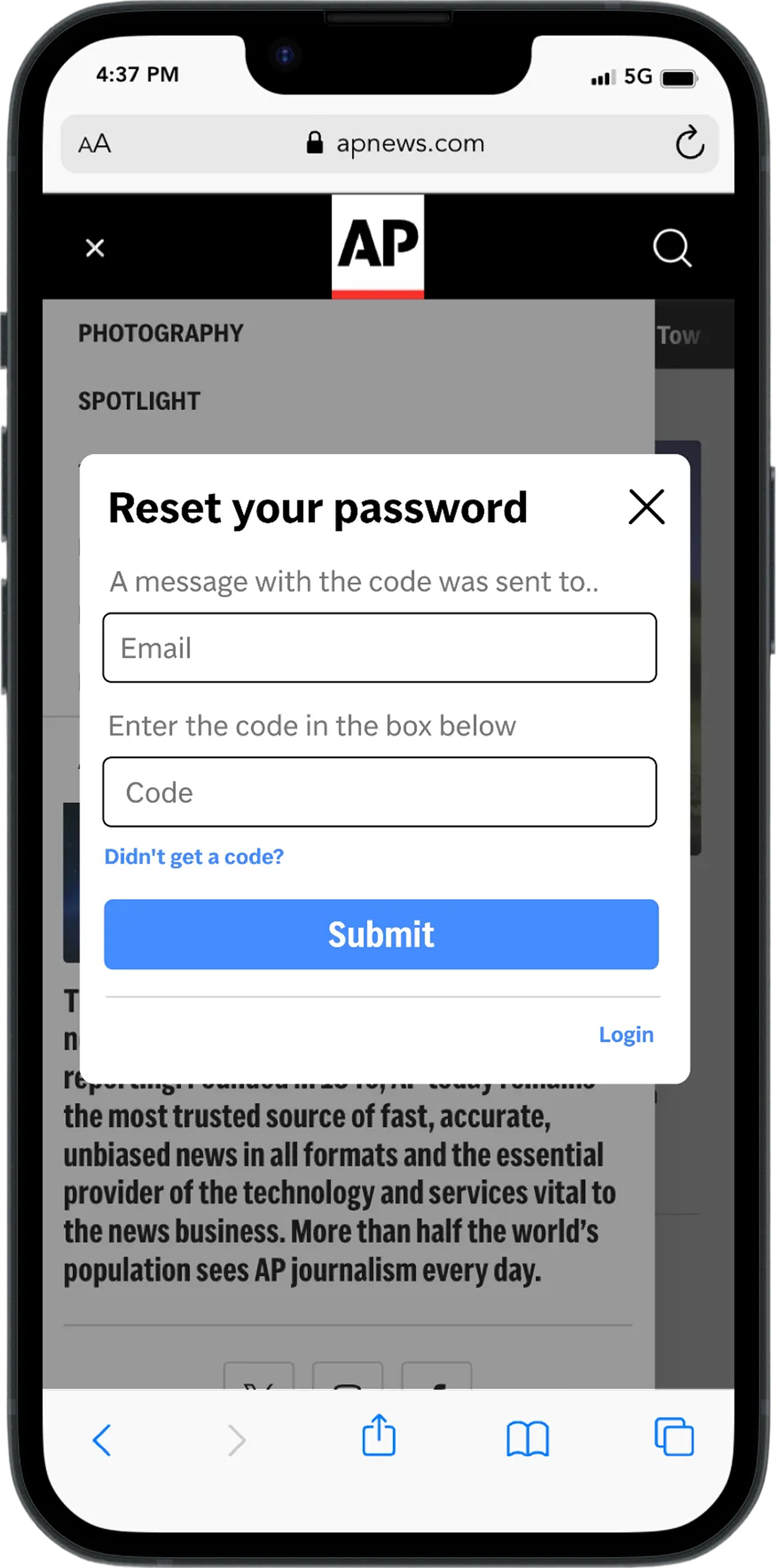
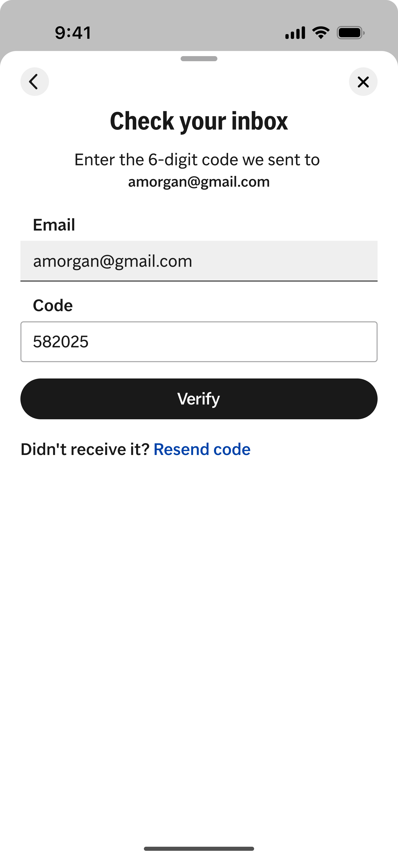
Verification states were standardized across code and email-based flows to reduce drop-off at the most common failure point.
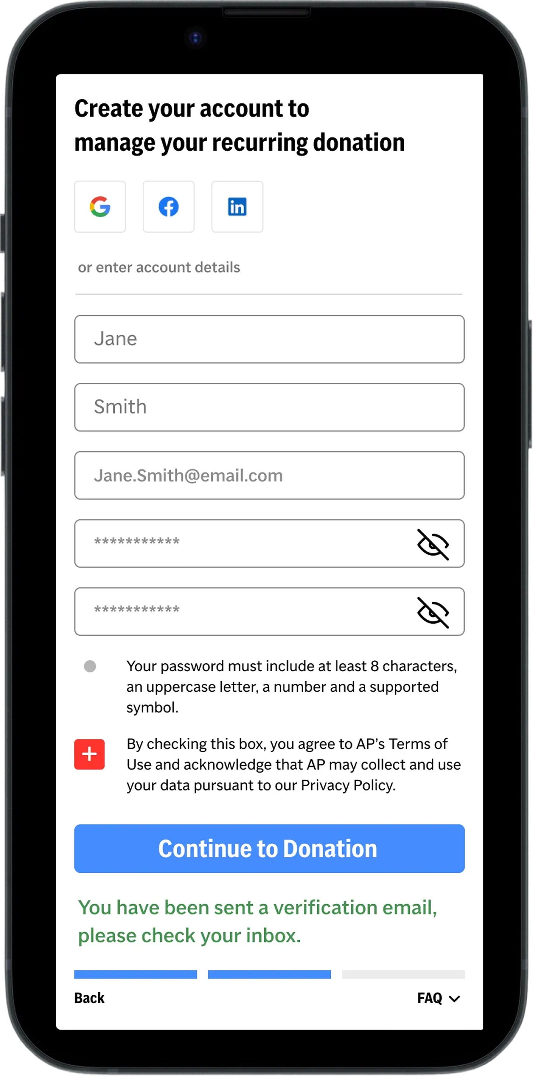
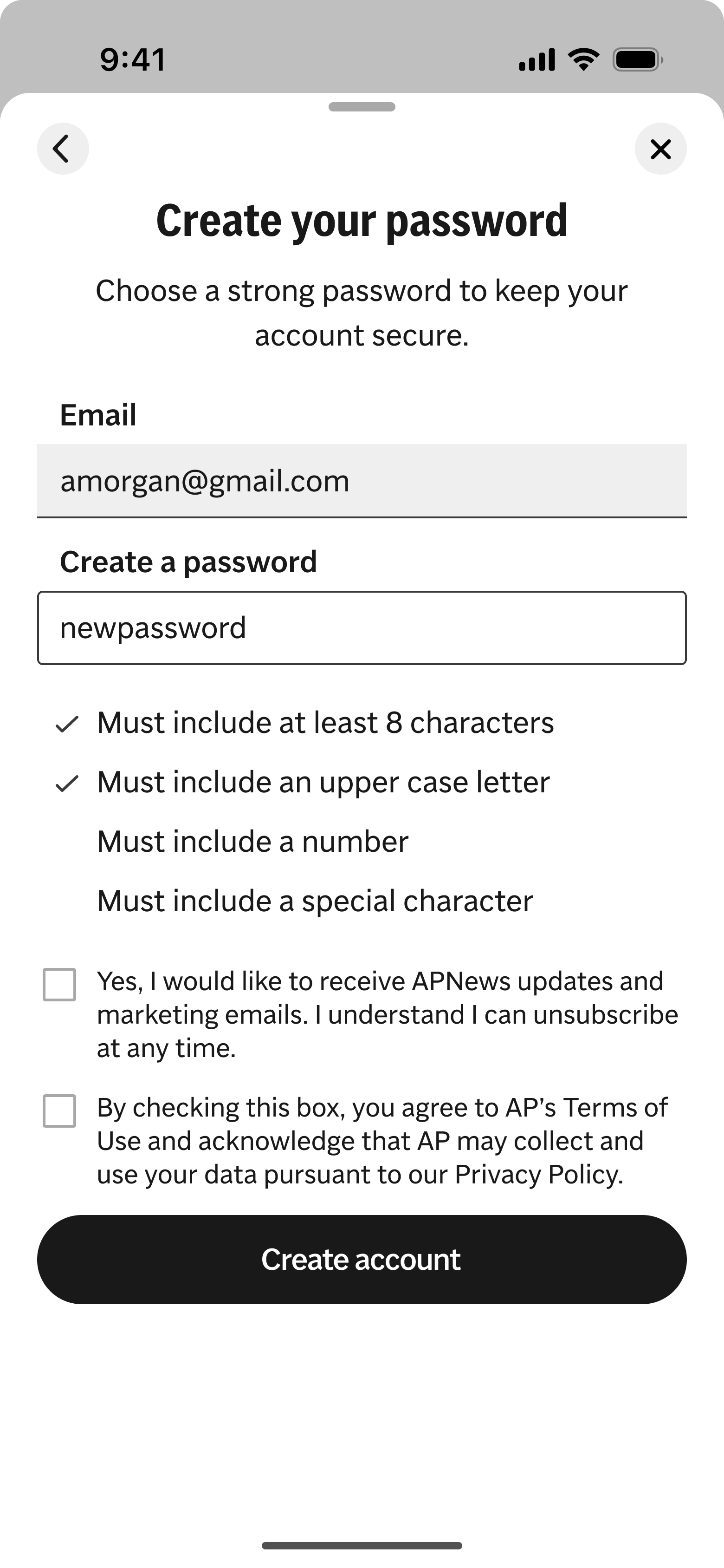
Clear progression and visible requirements reinforce confidence and signal proximity to completion.
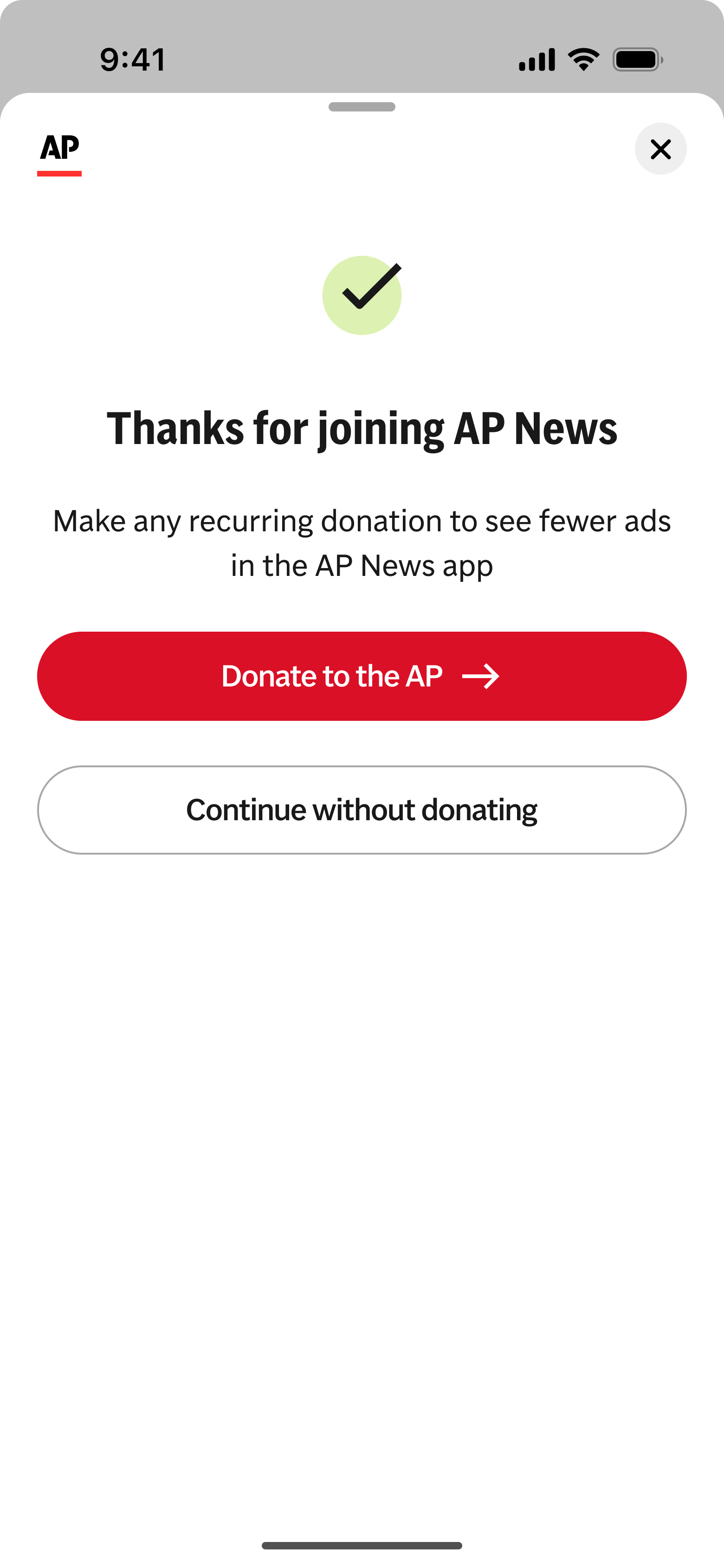
A clear success state confirms account creation and immediately returns users to the app experience, preserving momentum.
What changed
Account creation was no longer fragmented between web and app experiences
Verification flows were clearer and easier to recover from
Users could complete registration without leaving the app or losing context
Takeaway
Small structural improvements to high-friction flows especially around verification and recovery can meaningfully improve completion rates and compound downstream product value over time.
Why this mattered
Completed accounts unlocked key product entitlements, including:
Ad-light experiences for donors
Reduced donation prompts
Access to account-based features such as commenting, newsletters, and personalization
Outcomes & validation
Measured impact
After launching native account creation in the app, we saw a ~2% increase in completed account registrations within the first month. More users were able to successfully move from initial intent to verified, usable accounts without dropping off during validation.